
Showing posts with label Film Posters. Show all posts
Showing posts with label Film Posters. Show all posts
Monday, 26 July 2010
Friday, 23 July 2010
Self Designs
I decided to look at my own bedroom walls for inspiration for a little project. What better film posters to redesign than the ones that I own? First of all I chose the 80's classic 'Ferris Bueller's Day Off', and decided to go with the minimal route. I like this effort because it's something that you would get if you have seen the film, if not then you lose out. Watch it!

Below is another variation on my initial idea. 'The Warriors' is one of my favourite films and tells the story of several gangs who all gather in New York for a truce, until someone is shot and it becomes a race home for the protagonist gang; The Warriors. I thought I would continue to use the idea of depicting a piece of clothing and decided to go with a baseball jersey that the members of the 'Baseball Furies' wear. Again I would recommend the film to anyone!

Below is the last of three self designed posters. Again I chose to depict items of clothing, this time two dresses rather than one shirt. I'm not sure about the red background but I couldn't find another colour that looked better. Now 'Romy and Michele's' is my all time favourite film so to me the images you see are instantly recognisable, others might not be so understanding.

Minimalist Film Posters
I found this artist and absolutely loved their work instantly. There is not much I can take from the website, mainly because it is in Spanish and I'm not fluent, but one thing I have found is it is a man named Pedro Vidotto. I don't think its necessary to know much about the artist to understand the intent behind their work. I think if I wanted to create minimal posters I would definitely go in this direction. In fact I think I may try some designs similar to these, but advertising some of my personal favourite films. They will be posted soon.

Poster Layouts
When surfing on youtube I came across this little video which I found quite amusing. It shows the vast number of posters that have used the 'open legs' stance, a number that I had no idea was so big. It's interesting to see such variety, and how so many films you wouldn't expect to use it have. Some examples being 'Honey I Shrunk the Kids' and 'Chicken Little'. However the majority of posters shown are typical, for example pretty much every 'National Lampoon' and a few from the James Bond series.
I also found this video, which is pretty much the same idea but shows the 'Evil Eye' approach. I would say it is slightly less interesting because the idea seems to be used for mainly horror films. Some work a lot better than others, with a few of my favourites being 'Requiem for a Dream' and 'Blindness'.
Highest Selling Movie Posters
Film Title: Touchdown Mickey
Specs: One Sheet, 1932
Sold Price: $79,800
Film Title: King Kong
Specs: One Sheet, 1933
Sold Price: $80,500
Film Title: Outlaw
Specs: Six Sheet, 1943
Sold Price: $83,648
Film Title: Wings
Specs: One Sheet, 1927
Sold Price: $86,250
Film Title: Casablanca
Specs: French Size, 1942
Sold Price: $86,608
Film Title: King Kong
Specs: German Size, 1933
Sold Price: $87,000
Film Title: Black Cat
Specs: Half Sheet, 1934
Sold Price: $89,625
Film Title: Three Little Pigskins
Specs: One Sheet, 1934
Sold Price: $96,000
Film Title: King Kong
Specs: One Sheet, 1933
Sold Price: $98,900
Film Title: Freaks
Specs: Insert, 1932
Sold Price: $107,550
Film Title: Mad Doctor
Specs: One Sheet, 1933
Sold Price: $138,000
Film Title: Babe Comes Home
Specs: One Sheet, 1927
Sold Price: $138,000
Film Title: Phantom of the Opera
Specs: One Sheet, 1925
Sold Price: $155,350
Film Title: Frankenstein
Specs: One Sheet, 1931
Sold Price: $198,000
Film Title: Flying Down to Rio
Specs: One Sheet, 1933
Sold Price: $239,000
Film Title: King Kong
Specs: Three Sheet, 1933
Sold Price: $244,500
Film Title: Black Cat
Specs: One Sheet, 1934
Sold Price: $286,800
Film Title: Dracula
Specs: One Sheet, 1931
Sold Price: $310,700
Film Title: Bride of Frankenstein
Specs: One Sheet, 1935
Sold Price: $334,600
Film Title: Metropolis
Specs: German Size, 1927
Sold Price: $357,750
Film Title: Mummy
Specs: One Sheet, 1932
Sold Price: $453,500
Film Title: Metropolis
Specs: German International, 1927
Sold Price: $690,000
A Survey
I thought it was time I did some information gathering that I was actually in control of, so I got out there and asked the public on their opinions. I asked fifty people; 'Have you now or have you ever had a film poster displayed on your wall?'. If the answer was yes I then asked 'Name the film(s) they represent?'. I was pleasantly surprised to find out that over 50% of people had displayed movie posters, in fact 31 of 50 said yes. I was even more surprised by the posters themselves, as a certain few answers kept cropping up. The ones which seemed most popular have to be:
Kill Bill, The Dark Knight, Back to the Future, Blade Runner, Terminator and Pulp Fiction.
Below is an images of the sketchbook where I gathered all this information.

After hearing the results I thought I would look into the most popular choices and determine just what it is about their designs that make them so popular. So below are the six most desirable posters in the eyes of the people I questioned. In all fairness I can see why people chose these options as they are bold and depict the main characters in the best way possible. However there is just something about them all that I find lackluster, may be its the lack of artistic merit or maybe it's because I'm not a big fan of the films themselves. My favourite would have to be the 'Blade Runner' design, most probably because its considered a staple of poster design and at the end of the day its one hell of a good film.


Wednesday, 21 July 2010
Movie Magazines
Something I noticed every month when buying either 'Total Film' or 'Empire' was that there would always be a movie poster on the back. Obviously given the context there would have to be, but I find it interesting as to which film would be given the back page. A pattern I have found is that it's never usually a film that is expected to do well, but instead one that may underperform. It's as if being given the back page is an extra marketing boost.

Olly Moss
As an avid reader of Empire magazine I couldn't help but notice a regular feature. It involves young graphic designer Olly Moss, re-imagining a movie poster for the latest release. Every week I have liked his interpretation and look forward to the next issue just to see how he has took on the next challenge. Below are a few examples of his work.


Art of the Modern Movie Poster
Below is the introduction from one of my most treasured books; 'The Art of the Modern Movie Poster'. It discusses the development of the Movie Poster post World War II in several parts of the world. It's a fascinating read and details several key moments of the process.
The world changed in 1945, and so did the film industry. In Hollywood the golden years were over. Americans would never again attend the movies in such high percentages or with such passionate regularity. The wartime need for escape had come to an end: there were families to be reunited, and lives to be reformed. Also, a new medium - television - was about to do to movies what the internet would do to television fifty years later. Studios cut back on the budgets for their films, as well as the promotional campaigns that accompanied them. After the Hollywood Anti-Trust case of 1948 which separated the studios from theater chains they owned, the film business broke wide open, allowing a new wave of independent producers and distributors to enter the market. With little motivation to continue to produce the expensive advertising material they had issued in the 20's and 30's, the studios eventually all closed their in-house poster distribution operations, turning that job over to an independent company, the National Screen Service, which would handle posters for the majors and most if the minors until it went out of business in 2000. During the war, most of the studios had also abandoned the expensive stone lithograph process that produced the sharp, deeply saturated colours of the 20's and 30's movie posters, turning instead to the far less costly process of offset printing. Taken together, all of these changes meant a new kind of movie for a new kind of audience.
In Europe and Asia, of course, the situation was far more dire. Filmmaking had simply ceased in some countries, and when it picked up again, the going was slow and investors were hard to come by. The first post war posters were from Europe were often cheap two or three colour affairs printed on flimsy paper - poor substitutes for the huge, colourful posters that had once covered walls in Paris, Rome and Berlin. These countries, too, would see new, independent producers enter the industry, and eventually the movie poster returned, enjoying a particular renaissance (appropriately) in Italy. In Communist Eastern Europe, film production and distribution became largely the business of the state. This worked to the advantage of poster artists, particularly in Poland, where the next generation of designers learned to work brilliantly within the new limitations, helping to give birth to a modernist movement in poster design that would prove to be hugely influential. Free of commercial constraints, these designers considered themselves artists, and the government ministers, happy to have "people's art" they could point to with pride, supported them in their endeavours, holding exhibitions, founding schools, and establishing prizes. These posters caught the eyes of collectors and dealers, and an old profession acquired a new prestige.
In devastated Japan, it was the U.S. government that put the movie business back on its feet. Operating at first under the strict control of American censors, the old studios reorganized, and a fresh generation of talent emerged - led most famously by Akira Kurosawa, whose Rashomon (1950) introduced Japanese cinema to much of the Western World when it won the top prize at the Venice Film Festival in 1951. Also, old masters like Yasujiro Ozu, Kenji Mizogucki, and Mikio Naruse entered their most profound periods. But most beneficial for the movie poster, Japan witnessed an explosion of popular genres, as new legions of sword wielding samurai, city stomping monsters and tattooed gangsters took over the screen. These busy, lurid, energetic films required a busy, lurid, energetic style of poster making, and the Japanese found it in the art of photomontage, which the studio artists elevated to new heights of baroque insanity.
On the downside, the rise of photo-based posters meant the decline of hand-painted posters. Photomontage posters were inexpensive to create, well-suited to the modern offset printing methods, and pleased actors and agents with their emphasis on star presence. Though it would take another twenty or thirty years, photomontage eventually became the accepted standard in most of the world, gaining a final advantage in the 1990's as computer applications such as Photoshop entered the picture.
Today, the poster is no longer the centre of film promotion. Television advertising has taken over that role, and the one-sheet poster, once ubiquitous in America, is now produced mainly for lightbox display in theatre lobbies, carrying the same "key art" designed to be used in platforms from bus panels to Internet banners. The hand-painted poster has become rare, a prestige item that only a few privileged filmmakers are allowed to commission. There are, of course, many examples of dazzling photographic posters, but most poster aficionados will agree that something went out of the art form when Photoshop came in. The emphasis now is not on execution, but on concept and communication. A person flipping through a magazine, surfing the Internet, or driving past a billboard may not have the time or training to appreciate Peter Strausfeld's woodcuts or Zdenek Ziegler's selection of typefaces. The message must be fast and hard: who's in it, and what it's about.
Still, it would be foolish to declare that the movie poster is dead. As a form of street art, film posters retain an appeal and mystique that no advertisement for fruit-flavoured vodka or cell phone services will ever be able to capture. For the stroller through Tokyo, Paris, New York and other great cities that support a street-level public, movie posters continue to jump out from the indiscriminate jumble of advertsing messages. The promises they make are almost invariably broken by the films they promote, but as you pass them you cannot help but feel a certain frisson, a leap of the mind toward new people and places, toward stories other than our own. More than just marketing, these posters are invitations to the imagination, forever beckoning us to join new worlds.
By Dave Kehr
Tuesday, 13 July 2010
Timeline Analysis
After collecting a selection of popular posters from each decade from the twenties to the noughties I have come up with a few conclusions. Firstly it is obvious to see the clear development through the years, and after breaking it up further it becomes clear that the biggest leap in design differences is from the 1970's to the 1980's. Before then things seemed to be usually hand rendered, with a collage of different characters meshed into one single frame, but after things began to change. The seventies introduced the used of photo imagery and separating the text from the image itself. Often boxes where used for this effect, as is evident in the Godfather example on the previous post. However the eighties took it one step further and started to use simple snap shots combined with what seemed like a popular dark colour scheme. More blues and blacks and metallics were used, maybe it was because of the increased sci-fi releases.
Anyway, starting at the beginning it is clear to see that neutral colours were popular. Mostly browns and beiges bordered designs that did feature beautiful typography, which when explored closely becomes obvious it is hand rendered. This method was pretty prominent right through to the 40's. Not much changed, however with the introduction of more film genres concepts became more abstract and illustrations more vivid. I would say that the first sign of change came in the 50's with the burgeoning 'epic' genre which called for higher profile posters and an all round better standard. The sixties still ran along the same lines but with artists like Saul Bass making a name for themselves, posters became more diverse and underground. More variations also became available, usually your standard theatrical release and a redesigned, more arty version by people who where beginning to appreciate poster design as an art form.
Then came the seventies and the eighties where things really took off, leading to to the nineties. It was almost as if people became lazy and just did the simplest thing. Usually meaning your bog standard nineties film poster contained a photo of the principal cast members or a key piece of scenery taking up the majority of the page, and the title placed at the bottom in the middle. It seemed as though so much effort was going into creating the film itself, there was no expense spared to advertise the feature. Fortunately things seemed to change in the noughties and variation was once again popular.
In conclusion there has been a long period of development in regards to film posters, but I think we are currently in a place where experimentation is applauded and many artists spend their time perfecting their own interpretations. Hopefully this will continue and the industry will flourish, with big time movie producers unafraid of taking a gamble on an artists vision.
A Timeline of Progression
1920's
The transition to sound-on-film technology occurred mid-decade with the talkies developed in 1926-1927, following experimental techniques begun in the late 1910s. With sound, the concept of the musical appeared immediately, as in The Jazz Singer of 1927, because silent films had been accompanied by music for years when projected in theaters.

1930's
Many full-length films were produced during the decade of the 1930s. A lot were fantastical and adventurous films to keep people's minds away from the Great Depression. The studio system was at its highest with studios having great control over a film's creative decision.

1940's
The decade of the 1940s in film involved many significant films. Hundreds of full-length films were produced during the decade of the 1940s. The great actor Humphrey Bogart made his most memorable films in this decade. Orson Welles's masterpiece Citizen Kane was also released. The film noir genre was at its height.

1950's
Films of the 1950s were of a wide variety. As a result of television, the studios and companies sought to put audiences back in theaters. They used a more techniques in presenting their films through widescreen and big-approach methods, such as Cinemascope, VistaVision, and Cinerama as well as gimmicks like 3-D film. Big production and spectacle films perfect for this gained popularity with the many historic and fantasy epics.

1960's
The decade is known for being prominent in historical drama, psychological horror, and comedy, as well as the sub-genres of spy film, sword and sandal, and spaghetti westerns, all peaking during this decade. Beginning in the middle of the decade due to the start of the cultural revolution and the abolishion of the Hays Code, films became increasingly experimental and daring and were taking shape of what was to define the 1970s.

1970's
In cinema all over the world, the seventies brought about vigor in adventurous, cool and realistic complex narratives with rich cinematography and elaborate scores. The decade opened with Hollywood facing a financial slump, reflecting the monetary woes of the nation as a whole during the first half of the decade. Despite this, the seventies proved to be a benchmark decade in the development of cinema, both as an art form and a business.

1980's
The 1980s saw the continued rise of the blockbuster, an increased amount of nudity in film and the increasing emphasis in the American industry on film franchises, especially in the science fiction, horror, and action genres. Much of the reliance on these effect-driven blockbusters was due in part to the Star Wars films at the advent of this decade and the new cinematic effects it helped to pioneer.

1990's
The 1990s were notable in both the rise of independent cinema - as well as independent studios such as Miramax, Lion's Gate, and New Line - and the advancements in CGI-technology, seen in such films as Terminator 2: Judgment Day and Jurassic Park. The Disney Renaissance begins in 1989 with The Little Mermaid, reaches the peak in popularity with The Lion King in 1994, and ends in 1999 with Tarzan.

2000's
Building on developments in the 1990s, computers are used to create effects that would have previously been more expensive. In addition, film genres not known for their popular appeal in North America became increasingly attractive to filmgoers: films in foreign languages and documentaries for example.


Ernesto Cabral, Mexico

Cabral returned to Mexico in 1918 where he established himself as a top caricaturist. His work often appeared on the covers of magazines such as the weekly "Revista de Revistas".
As with many artists, his commercial work was rarely signed on any advertising posters. Cabral also painted murals, one of which can be found in Toluca, Mexico. Cabral died in 1968.
I really like his style and authentic Mexican vibe. The expressive faces on his characters are utterly mesmerising and draw you in completely. More often than not his designs feature several figures and an interesting piece of text that is usually positioned in a strategic manner so as not to obscure his illustrations. I would definitely choose Cabral as the artist from Mexico that best defines the country's style. Most probably because of his use of colour, and after all Mexican culture is very colourful to say the least.
Monday, 12 July 2010
Notable Artists
Simply taken from Wikipedia's entry on Movie Posters below is a list of artists who have made a mark in the industry. With each name I have posted one example of their work. There is an incredible range in design genres and it just goes to show how such a small topic can be very varied. In alphabetical order:
 John Alvin
An award-winning cinematic artist and painter who illustrated some of the world's most recognizable movie posters. Alvin created movie posters, which are also known as key art, for over 135 films over the course of his career, beginning with the poster for Mel Brooks' Blazing Saddles in 1974. His style of art for his posters became known as Alvinesque by friends and colleagues in the entertainment industry.
Blade Runner is my favourite for two reasons. One I love the film itself so I'm slightly biased and two I love the dark colour scheme which portrays the mood of the feature perfectly. The depictions of the characters are also spot on, from their poses through to the way they blend into their surroundings.

 Reynold Brown
A prolific American realist artist who drew large amounts of Hollywood film posters. Brown taught at the Art Center College of Design where he met Misha Kallis, then an art director at Universal Pictures. Through Kallis, Brown began his film poster work starting with The World in His Arms. He then did the art work for many high profile film posters including the Alamo.


An award-winning cinematic artist and painter who illustrated some of the world's most recognizable movie posters. Alvin created movie posters, which are also known as key art, for over 135 films over the course of his career, beginning with the poster for Mel Brooks' Blazing Saddles in 1974. His style of art for his posters became known as Alvinesque by friends and colleagues in the entertainment industry.
Blade Runner is my favourite for two reasons. One I love the film itself so I'm slightly biased and two I love the dark colour scheme which portrays the mood of the feature perfectly. The depictions of the characters are also spot on, from their poses through to the way they blend into their surroundings.

Richard Amsell
While a student at the Philadelphia College of Art, his proposed poster art for the Barbra Streisand musical Hello, Dolly! was selected by 20th Century Fox for the film’s campaign after a nationwide artists’ talent search. He quickly found enormous popularity within New York's art scene and more movie posters materialized.
I like Murder on the Orient Express because of the ingenius way he has grouped together this extensive cast of characters. I also like the style of his illustrations, it's reminiscent of the Art Nouveau movement and is similar to Alphonse Mucha's style of drawing. I also like how he has slotted the type perfectly either side of the daggers handle.
I like Murder on the Orient Express because of the ingenius way he has grouped together this extensive cast of characters. I also like the style of his illustrations, it's reminiscent of the Art Nouveau movement and is similar to Alphonse Mucha's style of drawing. I also like how he has slotted the type perfectly either side of the daggers handle.

A prolific American realist artist who drew large amounts of Hollywood film posters. Brown taught at the Art Center College of Design where he met Misha Kallis, then an art director at Universal Pictures. Through Kallis, Brown began his film poster work starting with The World in His Arms. He then did the art work for many high profile film posters including the Alamo.
This is my favourite because of just how iconic it has become. It's one of those posters that people seek out, the type of poster that students put up without knowing exactly what it's about. I personally think you don't need to have seen the film to appreciate it fully. It works so well as a piece of individual art. I also love the red type on a yellow background, I think it stands out brilliantly.

 Astrid Chevallier
She started to work as a graphic designer and assistant photographer in advertising agencies. Astrid relocated to Los Angeles in 2002 and brought her European influences and her conceptual vision to the table, she has been creating movie posters for major Hollywood Studios, award-winning independent film productions, and many award-winning short films.
To be honest I couldn't find much on this artist but I did like the example to the left. The first reason was because it reminded me of the original promotional image used for the sixties broadway show Hair, a personal favourite. But besides that I like how the names are placed in the smoke and the whole psychadelic vibe, on a subtle level and not too brash.

 Bill Gold
An American graphic designer best known for thousands of movie poster designs. During his 60-year career he worked with some of Hollywood's greatest filmmakers, including Clint Eastwood, Alfred Hitchcock, Stanley Kubrick, Elia Kazan, Ridley Scott, and many more. Furthermore, Bill Gold designed (and often photographed) posters for 35 consecutive Clint Eastwood films, from Dirty Harry (1971) to Mystic River (2004).
I think the Clockwork Orange poster needs little to none explanation. It's just become one of the most memorable images in movie poster history, even for someone like me who's never even seen the film. The use of triangles to encapsulate some of the imagery is clever, and I think has been inspiration for many things, including The White Stripes 'Seven Nation Army'.
 Mitchell Hooks
 The Brothers Hildebrandt
Twin brothers who collaboratively worked as fantasy and science fiction artists. They are best known for their popular The Lord of the Rings illustrations, painting the first Star Wars film poster, illustrating comics and cards, and their Magic: The Gathering illustrations.
Even though the image to the left is one that I personally don't know, mainly because it has been over-rided by many other Star Wars posters since, it is obvious to see this is the whole thing got it started. The colour scheme is just mesmerising and the placement of Darth Vader's head place right behind the hero; Luke Skywalker's, light saber is visually stunning. Also the way in which they have managed to include so many different aspects without appearing cramped but instead flowing around the page is a testament to their dedication to get it right.

 Robert McGinnis
An American artist and illustrator. McGinnis is known for his illustrations of over 1200 paperback book covers, and over 40 movie posters, including Breakfast at Tiffanys (his first film poster assignment), Barbarella, and several James Bond and Matt Helm films.
Besides from being one of the most successful films of all time, Breakfast at Tiffany's has many an iconic image spanning from the film adaptation of the Truman Capote Novella. The use of negative space is superb, and instead of overwhelming the viewer McGinnis has simply portrayed the glamourous side of the Holly GoLightly character in the foreground and given us a slight glimpse into the more vulnerable side of her persona.

 Drew Struzan
An American artist who has painted album covers, advertising, collectibles, and book covers, but he is best known for his extensive movie poster work. Popularly known by his signature first name on his work, Struzan is one of the industry's most recognized talents, having provided artwork for over 150 movie posters, including many of the best-known films of all time.
The illustration itself may be taken straight from the feature but it must have taken a lot of effort to capture it precisely. From the fire on the ground which symbolises speed to the way in which Marty McFly is looking at his watch symbolising time, you can gather from the single frame that the film is packed full of suspense, adventure and of course time travel.

Tom Chantrell
He left Manchester Art College and went into advertising, eventually starting in 1933 at Allardyce Palmer who had accounts with Warner Brothers and 20th Century Fox. In 1938 he designed his first film poster The Amazing Dr. Clitterhouse. Chantrell designed many posters for the Carry On films. The latter brought him some trouble when the poster for Carry On Spying had to be changed to avoid looking too much like From Russia with Love.
This is my favourite example because of the contrast between the objects that are seen on land at the top of the composition and the underwater items at the bottom. I also like the 'stacked' approach to the title and am instantly reminded of the iconic Ben-Hur poster created by fellow artist Reynold Brown.
This is my favourite example because of the contrast between the objects that are seen on land at the top of the composition and the underwater items at the bottom. I also like the 'stacked' approach to the title and am instantly reminded of the iconic Ben-Hur poster created by fellow artist Reynold Brown.

She started to work as a graphic designer and assistant photographer in advertising agencies. Astrid relocated to Los Angeles in 2002 and brought her European influences and her conceptual vision to the table, she has been creating movie posters for major Hollywood Studios, award-winning independent film productions, and many award-winning short films.
To be honest I couldn't find much on this artist but I did like the example to the left. The first reason was because it reminded me of the original promotional image used for the sixties broadway show Hair, a personal favourite. But besides that I like how the names are placed in the smoke and the whole psychadelic vibe, on a subtle level and not too brash.

Jack Davis
An American cartoonist and illustrator mainly known for his 'Tales from the Crypt' covers, but also created many film posters. Davis produced the artwork for the poster for the 1963 comedy chase film It's a Mad, Mad, Mad, Mad World. Davis' artwork for the comedy Western Viva Max! formed the centerpiece of that film's promotional campaign, and he did the same for the film Kelly's Heroes in 1970.
I like the cartoon approach and the composition of hundreds of people carfully balanced on top of the world, but yet still scrambling for what seems like a briefcase full of money which is falling away. I think it's a very clever way of communicating the message of the film in a humourous snap shot.
I like the cartoon approach and the composition of hundreds of people carfully balanced on top of the world, but yet still scrambling for what seems like a briefcase full of money which is falling away. I think it's a very clever way of communicating the message of the film in a humourous snap shot.

An American graphic designer best known for thousands of movie poster designs. During his 60-year career he worked with some of Hollywood's greatest filmmakers, including Clint Eastwood, Alfred Hitchcock, Stanley Kubrick, Elia Kazan, Ridley Scott, and many more. Furthermore, Bill Gold designed (and often photographed) posters for 35 consecutive Clint Eastwood films, from Dirty Harry (1971) to Mystic River (2004).
I think the Clockwork Orange poster needs little to none explanation. It's just become one of the most memorable images in movie poster history, even for someone like me who's never even seen the film. The use of triangles to encapsulate some of the imagery is clever, and I think has been inspiration for many things, including The White Stripes 'Seven Nation Army'.

An American artist and illustrator renown for artwork in magazines such as Redbook. Hooks also illustrated the U.S. Marine Corps book How to Respect and Display Our Flag and designed the original film posters for Dr. No, The Face of Fu Manchu and others. In 1999, he was inducted into the Society of Illustrators Hall of Fame.
The image to the right is perfect because it just encapsulates the entire James Bond franchise. It was started in the sixties as everybody knows and the use of pastels combined with the juxtaposition of several scantilly clad women and Bond himself, holding a gun, just works. The sign of a good poster is when no words are needed, just like here.
The image to the right is perfect because it just encapsulates the entire James Bond franchise. It was started in the sixties as everybody knows and the use of pastels combined with the juxtaposition of several scantilly clad women and Bond himself, holding a gun, just works. The sign of a good poster is when no words are needed, just like here.

Twin brothers who collaboratively worked as fantasy and science fiction artists. They are best known for their popular The Lord of the Rings illustrations, painting the first Star Wars film poster, illustrating comics and cards, and their Magic: The Gathering illustrations.
Even though the image to the left is one that I personally don't know, mainly because it has been over-rided by many other Star Wars posters since, it is obvious to see this is the whole thing got it started. The colour scheme is just mesmerising and the placement of Darth Vader's head place right behind the hero; Luke Skywalker's, light saber is visually stunning. Also the way in which they have managed to include so many different aspects without appearing cramped but instead flowing around the page is a testament to their dedication to get it right.

Frank McCarthy
A prolific American artist and realist painter renowned for advertisements, magazine artwork, paperback covers and film posters. Amongst McCarthy's film poster work were The Ten Commandments, The Great Escape, The Train, The Glory Guys, The Dirty Dozen, Dark of the Sun, On Her Majesty's Secret Service and Once Upon a Time in the West.
I like the use of white space in this piece and how the figures look as though they are escaping the page rather than the prison. From the inclusion of barbed wire around the title to the yellow beams of light, it is clear what this film is about from the outset and therefore the audience would know exactly what they are about to witness. I also like the centralised red text at the bottom of the page.
I like the use of white space in this piece and how the figures look as though they are escaping the page rather than the prison. From the inclusion of barbed wire around the title to the yellow beams of light, it is clear what this film is about from the outset and therefore the audience would know exactly what they are about to witness. I also like the centralised red text at the bottom of the page.

An American artist and illustrator. McGinnis is known for his illustrations of over 1200 paperback book covers, and over 40 movie posters, including Breakfast at Tiffanys (his first film poster assignment), Barbarella, and several James Bond and Matt Helm films.
Besides from being one of the most successful films of all time, Breakfast at Tiffany's has many an iconic image spanning from the film adaptation of the Truman Capote Novella. The use of negative space is superb, and instead of overwhelming the viewer McGinnis has simply portrayed the glamourous side of the Holly GoLightly character in the foreground and given us a slight glimpse into the more vulnerable side of her persona.

Bob Peak
An American commercial illustrator best known for innovative design in the development of the modern movie poster. The United Artists movie studio hired Peak in 1961 to help promote West Side Story. Peak later illustrated posters for designer Bill Gold including My Fair Lady and Camelot, the first six Star Trek films, Superman, In Like Flint and Apocalypse Now.
Even though I have never seen the film this has to be one of my favourite posters of all time. I love how the quite frankly, harrowing depiction of Marlon Brando blends with the orange sun whilst helicopters fly past. The one thing that resonates the most is the colour scheme. The bursts of orange are beautiful aesthetically but as soon as you some to realise what they symbolise it takes on a whole other meaning.
Even though I have never seen the film this has to be one of my favourite posters of all time. I love how the quite frankly, harrowing depiction of Marlon Brando blends with the orange sun whilst helicopters fly past. The one thing that resonates the most is the colour scheme. The bursts of orange are beautiful aesthetically but as soon as you some to realise what they symbolise it takes on a whole other meaning.

An American artist who has painted album covers, advertising, collectibles, and book covers, but he is best known for his extensive movie poster work. Popularly known by his signature first name on his work, Struzan is one of the industry's most recognized talents, having provided artwork for over 150 movie posters, including many of the best-known films of all time.
The illustration itself may be taken straight from the feature but it must have taken a lot of effort to capture it precisely. From the fire on the ground which symbolises speed to the way in which Marty McFly is looking at his watch symbolising time, you can gather from the single frame that the film is packed full of suspense, adventure and of course time travel.

Howard Terpning
An American illustrator and realist painter. He is known for many film posters of the 1960s and 1970s, Vietnam war art and Western art. Beginning with The Guns of Navarone in 1961, he became a prolific film poster artist for such films as Cleopatra, Doctor Zhivago, The Sound of Music, The Sand Pebbles and many others.
Again, another retro piece which depicts the film clearly from the outset. It's obvious straight away that there will be a lot of singing and dancing involved, and maybe even a little romance from the way the Baron is looking at the singing nun. It obviously doesn't indicate the presence of Nazi's but at the end of the day this is a great example of learning to omit certain things, and instead leaving more the imagination of the viewers.
Again, another retro piece which depicts the film clearly from the outset. It's obvious straight away that there will be a lot of singing and dancing involved, and maybe even a little romance from the way the Baron is looking at the singing nun. It obviously doesn't indicate the presence of Nazi's but at the end of the day this is a great example of learning to omit certain things, and instead leaving more the imagination of the viewers.
Saul Bass: Title Credits with Otto Preminger
I have found a great website called: wwww.notcoming.com which details all the title credits Saul Bass created or was credited to. Below are the different analyses for all of these credits. I know technically this isn't information regarding 'film posters' but Saul Bass is one of the best designers of all time and I think this shows how you can expand on flat, 2D design. However just to provide some info on posters I have shown the poster for each one which Bass also created. There are quite a few and it is obviously text heavy but if you are a fan of Bass' work, which many people are, then the information put across is very interesting. More often than not information about the film itself is also broadcast which when read helps place the credits Saul created in better context. Below are all the titles that Bass designed for the film maker Otto Preminger.
Carmen Jones, 1954:
Saul Bass’ first set of film titles was also the first of many projects for independent director-producer Otto Preminger, initiating a collaboration that would last for twenty-five years and a dozen films. For Carmen Jones, as he would for so many of Preminger’s films, Bass created a distinctive, iconic image by which the film would be instantly recognizable. The single, line-drawn image of a rose engulfed in a red, snaking flame echoes the red skirt of Carmen Jones, the rose between her teeth, and the destructive passions she arouses in Joe, the hapless young military officer.
The film itself is cited as a landmark film because of its all-black cast (its star, Dorothy Dandridge, was the first African-American woman to receive an Oscar nomination for a lead role) and Oscar Hammerstein’s reinvention of Bizet opera in African-American vernacular. Of course, given the film’s vintage, the film is as prickly and perhaps ill-considered as the original idea implies and, like its source material, is encoded with suspect notions about the evil, seductive powers of the black woman. Upon its release, James Baldwin famously lambasted the film for its parsing of stereotypes of light- and dark-skinned blacks. And enlivened as it is by Dorothy Dandridge’s scorching onscreen presence (revived in Preminger’s adaptation of Porgy and Bess five years later), the film nonetheless dispenses with the vocal talents of most of its performers in favor of those of “classically trained” (and often white) singers. As Jeff Smith has reported in his revealing essay on the film, Preminger and his producers seem to have equivocated on whether Dandridge and Harry Belafonte – though seasoned performers in the cabaret and calypso worlds, respectively – were up to the task of performing in the putatively superior musical form of opera.
The Man with the Golden Arm, 1955:

A sanguine courier of controversy, Otto Preminger shirked the Production Code seal of approval for his 1955 account of a drug addict’s plight, The Man With the Golden Arm. And while many tales of drug addiction have followed in its wake, Preminger’s film is a clear watershed. Though obviously dated in some of its aspects, its scenes of Frank Sinatra, as the eponymous doper, falling on and off the wagon remain chilling and continue to inform contemporary films with the same subject matter.
Bass’ titles for the film feature spiny, cut-out projectiles, vaguely redolent of veins and syringes, that manages to be disconcerting despite the accompaniment of Elmer Bernstein’s rather brassy jazz score. The lines proliferate and jab at awkward, unsettling angles with respect to the titles. And the title of the film is seemingly penned in by four of these lines, suggesting the many forces hemming in Sinatra’s Frankie from all sides. Finally, privileging Preminger’s credit, the titular “golden arm” (which actually refers to Frankie’s prowess as a card dealer and not the location of his track-marks) appears as a bent and tortured appendage, reaching out for either redemption or a fix.
Bonjour Tristesse, 1958:

Having cast aside the more minimalist aesthetic of his early title sequences for the manic abundance of his Around the World in Eighty Days titles, Bass seems to have continued his experimentations with more formally complex title sequences with his next two Preminger collaborations. Retaining his signature cut-out imagery, Bass integrates different transitions and dissolves, creating a palimpsest of bells for Saint Joan and a tapestry of flowers, shells, and raindrops for Bonjour Tristesse.
Both films are literary adaptations, debuting Jean Seberg in a pair of somewhat improbable roles as French women. And though the films achieve only mixed results, both feature interesting formal experimentation concurrent with Bass’ own efforts in the title sequences. While Saint Joan is more notable for its script (adapted by Graham Greene from George Bernard Shaw’s play) than for any visual innovation, Bonjour Tristesse showcases Preminger’s widescreen compositional sense and the agility of his trademark tracking shots. It also displays his mastery of both black-and-white and Technicolor palettes, as the film moves from the monochrome present-day of Seberg’s disaffected Parisian socialite to the vibrant lustiness of her Mediterranean youth.
Bass’ opening credits suggest the arc of Francoise Sagan’s story, with colorful abstractions of shells and coral that dissolve into stars and flowers. Finally, these flowers’ petals become raindrops and then – in the image that brands the film – tears. The themes of passion, metamorphosis, sexual awakening, and melancholy that mark the progress of the film all find resonance in these titles. Artfully, Preminger follows Bass’ credits with images of the black-and-white, present-day Paris, removing his audience from an abstract, colorful evocation of youth and into an already harsh and effete reality.
Anatomy of a Murder, 1959:

By 1959, Saul Bass had become an integral part of Preminger’s production team and his title designs an important element of the pitching and marketing of the director’s films. Bass’ designs for Anatomy of a Murder were devised long before cameras began to roll, making clear the value that Preminger placed on Bass’ work and its role in positioning and branding his films.
The titles for the film are among Bass’ most recognizable and, along with Duke Ellington’s score, lend the film its particular blend of sophistication and loose, improvisatory charm. Literalizing the film’s title, the credit sequence presents different cut-out (-off?) human limbs, which are in turn diced up into abstract decorative shapes. Echoing the deliberate manner in which the film dissects the circumstances of a murder case, the credits also provide some witty juxtapositions of titles and images: James Stewart naturally gets the head; Lee Remmick a leg; Duke an arm; and Preminger’s credit comes once a disembodied hand seems to cover the lens. The central image of the segmented corpse is so effective and simple that Spike Lee’s production company lifted it wholesale for the film, Clockers, until Bass threatened them with a lawsuit.
True to Preminger’s appetite for provocation, Anatomy of a Murder is renowned for its use of some hitherto taboo words (ahem, panties) and its adoption of outré subjects such as rape and the insanity defense. But unlike some of his other notably controversial works, Anatomy of a Murder feels neither forced nor dated in its use of provocative subject matter. It is both a tightly constructed courtroom drama and an engaging ensemble character study, and like James Stewart’s rumpled Michigan lawyer, it remains at once clever and down-to-earth.
Exodus, 1960:

As Otto Preminger’s films grew in scope (and length) in the late 1950s and early ’60s, Saul Bass’ titles became important factors in distinguishing the films from the other Hollywood epics of the time. For 1960’s Exodus, one of Preminger’s most exhausting and bombastic films, Bass opted for a simple image, one that encapsulates the protagonists’ struggle for the nation of Israel in a manner that is perhaps more effective than the rest of the film.
Similar to the iconic credit sequence that Bass had created for Carmen Jones six years earlier, the central image is one of fire, though here it symbolizes nationalist fervor rather than lusty passion. In the midst of this flame is the central cut-out image of arms reaching up – in defiance, in struggle – against a backdrop of the rich, Mediterranean blue of the Israeli flag. As a result, the title sequence seems like something of a regression for Bass, returning him to the minimalism of his earliest credit sequences. But in its elegance and lack of presumption, this minimalism contrasts neatly with the massive, star-stuffed scale of the film’s narrative.
Advise and Consent, 1962:

Otto Preminger’s polemic of American government and law opens with a crude illustration of the US Capitol. Its dome is unhinged, displaying the film’s title with the playful interactivity of a cookie jar. The analogy lampoons the political iconography, equating it with the mundane functionality of a household object.
The credits appear in hand-drawn, cursive writing (Bass’ own), over cropped footage of an American flag bellowing in a slow-motion current against an empty, black background. The flag is robbed of its iconography. Perhaps enforced by the film stock, the color red is absent – no bloodshed – but more discrete is the absence of the flag's upper-left corner. The flag’s stars are omitted: no icons of unity to warrant the prize of liberty.
The Cardinal, 1963:

In the opening frames of The Cardinal, with the sound of a bell ringing over a Roman square on the soundtrack, a black-robed, stone-faced clergyman exits a church and walks through a maze of cloisters, colonnades, and crumbling architecture. The title sequence is composed entirely of live-action images (with the exception of the characteristically Bass-ian typeface), but like Bass’ most richly animated title sequences, it functions to suggest the style and course of the film in graphical terms.
The cardinal strides into and out of an elaborate series of frames – up staircases and across ornate piazzas – in a manner that prefigures the character’s professional course from a small Boston parish to the Vatican. Through a series of dissolves, the juxtaposition of staircases and Doric columns creates a tense network of competing horizontal, vertical, diagonal lines. This geometrical clash in the credit sequence is evocative of the knotty moral dilemmas that the protagonist will face in the rest of the film.
Indeed, Preminger’s film is very much a stroll through the problems of being a Catholic. Like the credits, the film itself is rather confusing and all over the place. While the film is another of the director’s controversial message-films, Preminger resists the temptation to being wholly scathing (as in similar of his films, he never quite shows his hand). Nevertheless it exploits every available moral issue to hand: interfaith romance, abortion, Southern cross-burning, Nazis, etc. But as always in Preminger’s work, the film is spared by the surprising richness of the characters (headed by empty-slate Tom Tryon), which includes John Huston, Ossie Davis, Romy Schneider, and Burgess Meredith.
In Harm's Way, 1965:

Preminger’s take on Pearl Harbor is a surprisingly effective film, and while it was made to coincide with the 20th anniversary of V-E Day, it is not an overly jingoistic affair. Again, the director provides a surfeit of locations, subplots, and minutes of running time, and again there is a glut of characters and big-name actors, but the acting is typically strong, featuring a fairly good, relatively vulnerable performance from John Wayne.
The credit sequence that Saul Bass contributed to this film came at the end of the film (a rather novel idea at the time) with only a single title card at the beginning. As it stands, the end credits fit In Harm’s Way ideally, lending the film the gravitas that it requires without burdening the Duke with overly portentous dialogue. Instead, Bass provides an entire narrative in credits and ocean photography. Backed by the rise and fall of Jerry Goldsmith’s score, Bass’ titles follow the sea’s whims from calm to violent – culminating in a montage of explosions and mushroom clouds – and then to calm again. The imagery is an adequate suggestion of the course of the war after the film’s events, a wordless and objective expression in nature’s terms, and as such, it allows the drama of the film’s characters to resolve itself without any grand history lessons.
Bunny Lake is Missing, 1965:

Released only a few months after In Harm’s Way, Bunny Lake Is Missing is almost its sister film’s antithesis in Preminger’s oeuvre. Neat, concise, and, like some of its characters, tightly wound, the film boasts only a rather small cast and a clever plot device (which, incidentally, seems to have been totally ripped off for this fall’s Flightplan, with Jodie Foster). But even without the elegantly constructed mystery, the film features some excellent character-actor performances from a weary, restrained Larry Olivier, a perverted Noël Coward, and Keir Dullea doing his best Anthony Perkins (to say nothing of a brief, gratuitous appearance by the Zombies). The presence of Dullea (along with the mid-60’s England setting) lends more than a little touch of Kubrick’s creepiness to the film, and the result is an unnerving psychological thriller that, even with Olivier’s kind reassurances at the end, manages to leave a nasty taste in one’s mouth.
Bunny Lake is a film that turns on the destruction of evidence, so Bass’ titles, which feature the tearing away of bits of paper to reveal the credits, precisely fit the film’s themes of concealment and revelation. The central image here – and the icon that helped to market the film – is that which accompanies Preminger’s credit: the shape of a little girl torn out of the black background. With this image, the titles also evoke the darker side of childhood, a sentiment reinforced with the first image of the film proper: the black background of the title sequence is torn away to reveal Dullea walking alone through a garden filled with toys but devoid of children.
Poster Sizes: The Rest Of...
Insert
Facts: A vertical format American movie poster, measuring 14"x36", generally issued rolled and on thicker stock paper. Their smaller size makes them popular with collectors. Inserts from the 60's and before were often issued folded. Generally much rarer than a one sheet. Studios stopped issuing these in the early 1980's.
Interesting Fact: The last Insert found to be issued was for the February 1986 release of 9 1/2 Weeks with the NSS number 860033.
30 x 40
Facts: A vertical format American movie poster measuring 30" x 40" printed on a very heavy card stock material. Most 30" x 40"’s feature the same artwork as the one sheet and were issued rolled to the theatre exchanges. The National Screen Service number is normally found on the side on the poster, as opposed to the lower bottom as is the case with one-sheets.
Interesting Fact: They are very difficult to find in near mint condition because the card stock can crease easily.
40 x 60
Facts: A vertical format American movie poster measuring 40"x60" printed on a heavy card stock material. Most 40"x60"’s feature the same artwork as the one sheet and were issued rolled. They were primarily offered for major motion pictures only and were displayed both inside and outside of theatres. A 40x60 poster display would cost the theater up to 20 times as much as a one sheet to rent.
Interesting Fact: Only a few hundred of these were printed, and it was only printed once. Unlike the one sheet which was printed in quantities of 10,000 and up.
Lobby Cards
Facts: Lobby cards are no longer used in theaters and are rarely printed for today's films. These small posters on card stock (usually 11"x14" in a horizontal format) were generally produced in sets of eight, intended for display in a theater's foyer or lobby. A lobby set typically consists of one Title Card, a lobby card of special design usually depicting all key stars, listing credits and intended to represent the entire film rather than a single scene; and seven Scene Cards, each depicting a scene from the movie. There are also Mini Lobby Cards measuring 8 1/2" x 10" (stills).
Interesting Fact: While lobby card sets were phased out of the United States theatres in the mid-1980's, other countries still issue them. Lobby cards are still produced in English for major productions and shipped for international use.
Thursday, 1 July 2010
DC: Matt Needle
I found this artist and was pleasantly surprised to discover that he creates his own versions of famous movie posters in his spare time. He is a recent graphic design graduate and must have a passion for films if he fills up his spare time with creations such as the ones below. In his profile he credits many influences from all different backgrounds, including the legendary Saul Bass. A personal hero of mine as well. You can definitely see this influence in his work, from the minimal use of colours to the strategic placement of text. I think I may take note and try to create some of my own re-imaginings.


It is purely coincidental that these three posters feature figures as the focal point. However I do like his approach to each individual one, with the 'Inception' example being my favourite. There are a few reasons for this, one being simply because I like the colour scheme and the choice of font. Another being the use of a 'maze' instead of the characters face, depicting the confusion and complexity of the human mind when it comes to dreaming. This may be the geek in me but I also like how you can tell it is Leonardo DiCaprio just from the outline.
Poster Sizes: Three Sheet
Fact: A very large vertical format American movie poster. Measuring approx. 41"x81", generally produced in 2 or 3 overlapping sections. Almost always folded. International versions were sometimes issued. Originally designed to be pasted on small billboards. Studios stopped issuing these in the late 1970's. This size poster always makes a statement and dominates a room.
Interesting Fact: Three sheets were originally utilized in the circus and vaudeville. Also they were printed in smaller numbers, meaning that fewer are available on the market.
Interesting Fact: Three sheets were originally utilized in the circus and vaudeville. Also they were printed in smaller numbers, meaning that fewer are available on the market.
Below are three examples of classic three-sheets:

Poster Sizes: Half Sheet
Facts: They were first introduced in the 1910's along with traditional one-sheets and lobby cards with the standard being a horizontal format at 22" x28". They were used widely for a long time until the 1980's when one screen and one feature film at a time was the norm in cinemas. After lobbies had to be divided up to promote several different films at once there was less space for half-sheets and therefore they were gradually phased out.
Interesting Fact: They are now very rare and popular to collectors because they are easy to frame. Its preferable if they have no fold marks.

Interesting Fact: They are now very rare and popular to collectors because they are easy to frame. Its preferable if they have no fold marks.
Below is a classic example of a half-sheet:

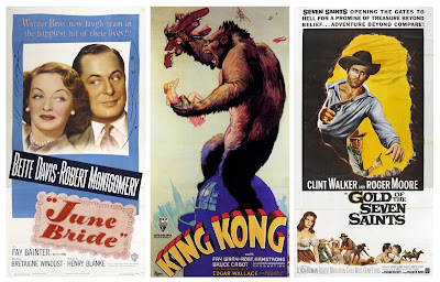
Poster Sizes: One Sheet
Facts: The most commonly used poster size usually measuring a standard 27" x 40". Before 1984 there was an extra inch vertically which allowed room for a border. However these are not what you always get, there can be quite a bit of variation with the only definite similarity being their vertical format. Up until the early 1980's, most were issued folded with one vertical and three horizontal creases. Some were even issued tri-folded. They are still used in theaters today but are now always issued rolled.
Interesting Fact: They are the most collectible and desired amongst film poster enthusiasts. They are considered the centerpiece of the movie paper industry, and normally command the highest dollar in relation to other sizes and styles.

Interesting Fact: They are the most collectible and desired amongst film poster enthusiasts. They are considered the centerpiece of the movie paper industry, and normally command the highest dollar in relation to other sizes and styles.
Below are three examples of classic one-sheets:

National Screen Service
I thought I would start at the beginning for the time being. After a little initial research I discovered that the company who was responsible for the evolution of promotional posters and the reason behind its success for over 40 years from 1940 to the mid 1980's was the National Screen Service. Now defunct, because of the introduction of multiplex cinemas and the change in printing materials, it was once incredibly important and was credited as the control center for over 90% of the movie paper distributed. It was eventually bought out by Technicolour Inc in 2000.
Subscribe to:
Comments (Atom)